Divi’s Fullwidth Slider Module comes with some great features including the ability to add sliders with parallax and video background. But, one feature that would make it even more powerful is the ability to expand to a full screen slider. Divi’s Fullwidth Header Module has this full screen option already so we thought it would be a good idea to show you how to add this same functionality to the those fullwidth sliders.
Adding full screen functionality to Divi’s Fullwidth Slider Module is extremely easy to implement with a few lines of CSS and Javascript. In just 5 minutes, you can convert your fullwidth slider into a full screen slider that expands to fill the entire screen on page load just like those full screen headers.
Let’s get started.
Implementing the Full Screen Slider Functionality with Divi
Step 1: Add a Fullwidth Slider Module with Slides
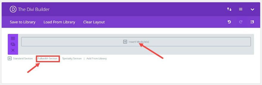
Using the Divi Builder, add a Fullwidth Section and click “Insert Module”.
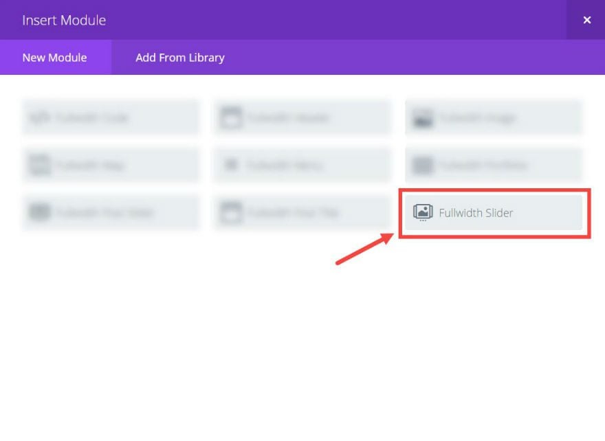
Add a Fullwidth Slider Module.
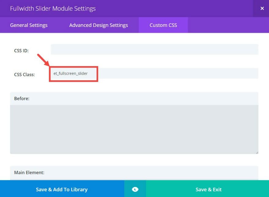
In the Fullwidth Slider Module Settings, under Custom CSS, add a CSS Class called “et_fullscreen_slider”.
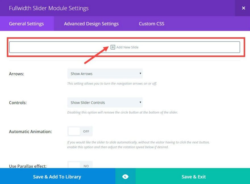
Under general settings, add a new slide.
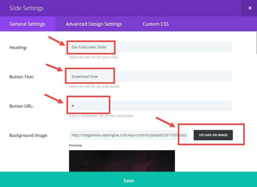
In the Slide Settings, under General Settings update the following:
Heading: [enter your heading]
Button Text: [enter your button text]
Button URL: [enter your button url]
Background Image: [add your background image] (I’m using an image from unsplash.com)
Repeat this step for as many slides as you need.
Save & Exit
Adding the Custom CSS and Javascript
From the WordPress Dashboard, go to Divi → Theme Options and, under General Settings, enter the following CSS in the Custom CSS text box:
.et_fullscreen_slider .et_pb_slide, |
.et_fullscreen_slider .et_pb_container { |
min-height: 100% !important; |
Next click the Integration tab and add the following javascript to the text box labeled “Add code to the head of your blog”:
$(window).on('load resize', function() { |
$('.et_fullscreen_slider').each(function() { |
et_fullscreen_slider($(this)); |
function et_fullscreen_slider(et_slider) { |
var et_viewport_height = $(window).height(), |
et_slider_height = $(et_slider).find('.et_pb_slider_container_inner').innerHeight(), |
$admin_bar = $('#wpadminbar'), |
$main_header = $('#main-header'), |
$top_header = $('#top-header'); |
$(et_slider).height('auto'); |
var et_viewport_height = et_viewport_height - $admin_bar.height(); |
if ($top_header.length) { |
var et_viewport_height = et_viewport_height - $top_header.height(); |
if (!$('.et_transparent_nav').length && !$('.et_vertical_nav').length) { |
var et_viewport_height = et_viewport_height - $main_header.height(); |
if (et_viewport_height > et_slider_height) { |
$(et_slider).height(et_viewport_height); |
That’s it!
Wrapping Up
Now you have a full screen slider for your website. Use it to create beautiful and effective sliders for your hero section that fills any screen on any device.
I hope you enjoy this useful addition to your Divi site.
If you have any questions feel free to post theme in the comments.
Cheers!

